Mountain Dew’s New Look – What Other Brands Can Learn
- Who is the Mountain Dude and why is he so happy?
- In 1885, Frank Robinson invented the iconic Coca-Cola logo. What was his job with the company?
- What are the two main reasons brands change their package design?
In his best-selling book Blink, author Malcolm Gladwell presented his theory of “thinking without thinking.” The Amazon blurb on the book notes that it presents research from psychology and behavioral economics on the adaptive unconscious: mental processes that work rapidly and automatically from relatively little information. In a nutshell, the book points to the immense power of first impressions.
Nowhere is this power more evident than on the retail grocery shelves. To paraphrase Gladwell, brands flourish or fail every day in the blink of an eye. Why? Product packaging, point-of-sale displays and advertising that incorporates these elements communicate the product’s benefits almost instantaneously.
What This Means for You — For reasons that will be explained, the soft drink category is particularly susceptible to the challenges of first impressions at retail. So, when a brand like Mountain Dew (originally launched in the early 60s) undertakes a refresh of its logo, packaging, POS and advertising, other brands pay close attention. If your brand is considering a first impression injection, read on.
*****
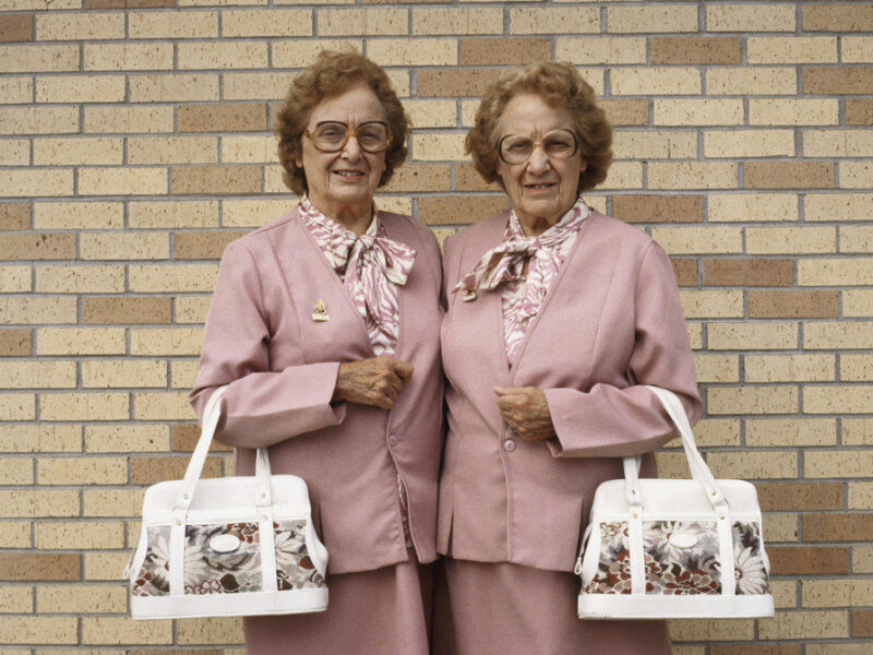
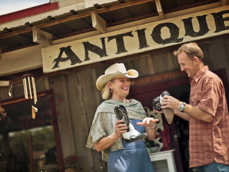
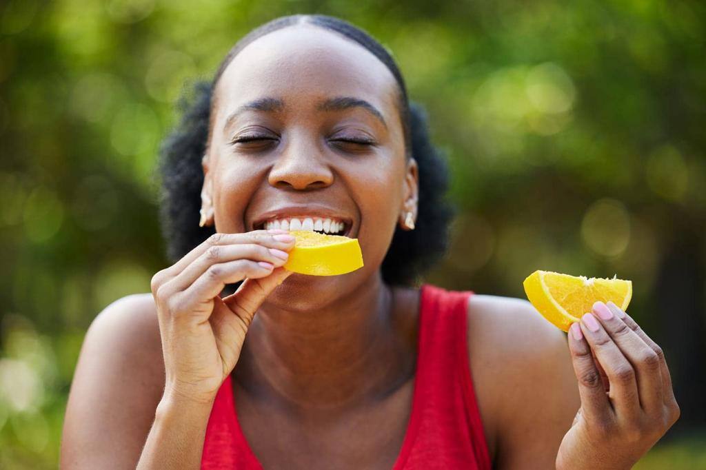
And in marketing, first impressions are also about relatability. Companies use images that mirror their audience’s values, interests, and lifestyle to make them feel seen and understood. Seeing someone like myself enjoying a product makes me think, “Hey, maybe I’d like that too!” Want to make a great first impression on your audience? Be authentic with your images. Click here to see portraits of the way we live.
*****
They Call It That Good ‘Ol Mountain Dew
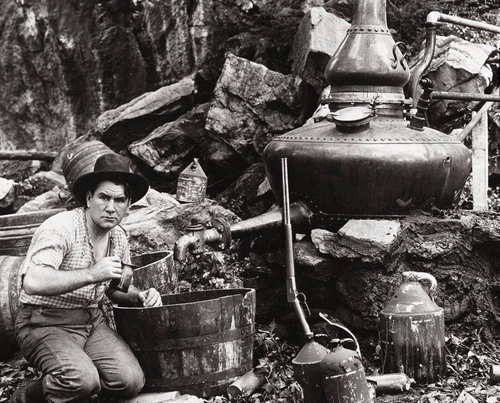
Anyone who grew up, attended college or has visited the Appalachian Mountains area of the Southeast US – states such as Georgia, Tennessee, Kentucky, the Carolinas, the Virginias – has heard stories, or perhaps even consumed homemade liquor. The favored terms for this high octane and illegal booze were “moonshine” or “mountain dew.”
Given this history, it made perfect sense for two Tennessee brothers, Barney and Ally Hartman, who at the time (1940) were in the “legal” whiskey business, to invent a soft drink mixer for their primary liquor product. About 20 years later, a recalibrated formula of this mixer was launched at retail, and they called it “Mountain Dew.”
In 1964, things got a lot more interesting for this regional soft drink. Retail behemoth, the Pepsi-Cola company, bought the name and production of this citrus beverage. Not even the illegal whiskey drivers, some of whom later became stars of the NASCAR circuit, could drive sales as fast as Pepsi could!
According to this history, “Between the 1940s and 1980s there was only one variety of Mountain Dew, which was citrus-flavored and caffeinated in most markets. Diet Mountain Dew was introduced in 1988, followed by Mountain Dew Red, which was introduced and discontinued in 1988. In 2001, a cherry-flavored variant called Code Red debuted. As of 2017, Mountain Dew represented a 6.6% share of the carbonated soft drinks market in the US.”
Goodbye Extreme Sports, Hello Great Outdoors
It is appropriate that many of the products in the “refreshment” category feel the need for regular brand refreshment. Mountain Dew, with its many creative updates, has always embraced adaptation to a changing marketplace. Recently, the brand announced a major packaging update.
Long associated with extreme sports and athletes, Mountain Dew is returning to the mountains with a revamped visual identity, according to Marketing Dive. “A new logo includes the brand’s eponymous topography, along with a retro, three-dimensional font that spells out the soft drink’s full name rather than the abbreviated “Mtn Dew” moniker that has been in use for more than a decade.
“The overhaul aims to tap into Mountain Dew’s citrus-flavored refreshment while celebrating the great outdoors and good times with friends. The look will roll out in the U.S. starting next summer (2025) across all brand touchpoints, including packaging, equipment, advertisements and experiences.
“Nothing is more powerful than how you show up on the shelf and how you talk about the brand from a logo and iconography system,” said JP Bittencourt, vice president of marketing at Mountain Dew in a Marketing Dive article. “As we took stock of where we were, we really felt it was important to refresh and make a meaningful change in our visual identity system.”
This visual refresh comes on the heels of the brand’s other promotional changes. These include:
- Reinvigorating the brands tagline – “Do the Dew”
- Introduction of a new brand character – The Mountain Dude
- Claiming the Mountain Time Zone as the company’s own
- Enacting a larger shift away from an individualistic, extreme positioning toward a more ownable space around “energizing refreshment”
The Risks and Rewards of Changing Packaging
Creative directors and designers have strong personal opinions about what makes for a great first impression at retail. However, most of these passionate professionals agree on one thing: Coca-Cola is the big kahuna on the soft drink aisle!
But don’t take our word for it.
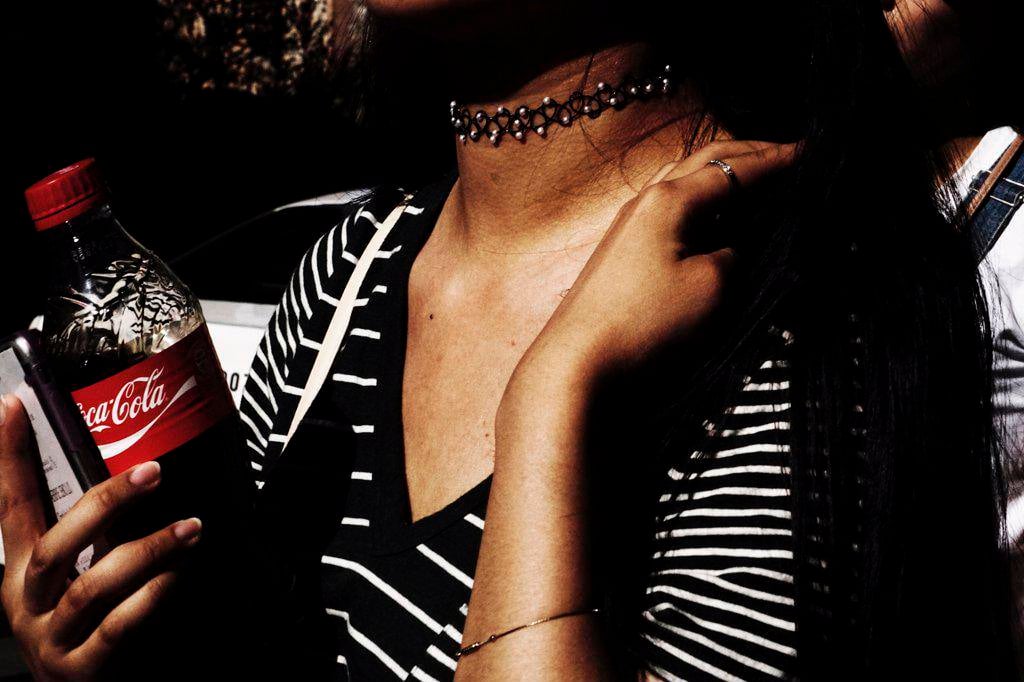
The UK-based organization, The Chartered Institute of Trade Mark Attorneys points out, “In 2022, Coca-Cola’s brand was valued at 97.9 billion US dollars – a long way from its humble beginnings in 1886 in a pharmacy in downtown Atlanta. Considered one of the world’s most recognisable logos, the Coca-Cola mark is also one of the most valuable in the world. The easily recognisable script of the mark is enhanced by its consistent presentation in red and white colourway, which stands out on the shelves and is eternally associated with the brand.
“One of the most distinctive elements of the mark is its font. The world-famous font was created by bookkeeper Frank Robinson in 1885 and was ‘borrowed’ from the Bureau of Alcohol, Tobacco and Firearms’ Inland Black Letter Typeface. The Coca-Cola ‘Spencerian’ script mark was registered in the US in 1905, and in 2011, the U.S. Patent and Trademark office recognised his original logo as ‘one of the most famous trademarks globally.’”
So much for the need to refresh a logo and packaging on a regular basis. If it ain’t broke…etc.
Changing the look of any product brings both risks and rewards. According to the experts at Aylesbury Box Company, “The main reason why brands change their packaging is because both business and customer preferences evolve. What worked when the business was launched may now fall short. Therefore, adapting the brand identity is an essential element in shaping the future of the business.
“The company wants to convey a different image, and research tells them that customers are looking for them to deliver something specific. This might include healthy, sustainable, ethical, dependable or fun. A fresh image can be achieved through color, typography, imagery, packaging design and materials.
“Rebranding comes with an element of risk. Get it wrong and you risk losing loyal customers. Many people don’t like change. As a result, they feel disappointed when the logo or packaging they know, and love is altered. However, get it right and it plays a key role in staying relevant and attracting new customers.
“The key to successful rebranding is clarifying your purpose. This involves understanding how your business is perceived and the messages that are important to your customers.”
Product rebranding “failures” in the past can inform brand marketing teams on making better decisions in the future. PKG Design is a packaging design firm with a wealth of experience with consumer-packaged goods. The agency points to four CPG products that experienced the sound of a sad trombone in their repackaging projects.
Tropicana
“Tropicana is one of the most famous examples of what can go wrong with new packaging design. In 2009, this iconic juice brand introduced a more modern look, which only lasted two months on the market. During this time, sales dropped 20%, prompting executives to drop the new look fast.
Monopoly
“Hasbro’s Monopoly is one of the most popular board games of all time. In 2008, the brand implemented a new packaging design that made the product almost unrecognizable. It catered to an urban, young-adult audience, and used a more modern look. The traditional houses became condos, all with a faux vintage looks and feels. This version of the game didn’t sell nearly as well and is rarely seen on store shelves.
Sierra Mist
“The Sierra Mist lemon-lime soda brand drastically changed its packaging design in 2009-2010. The new can featured a ‘misty’ looking product title that was difficult, if not impossible, to read. The background consisted of lines that were meant to resemble vines that would give the product a ‘natural’ vibe. This, however, did not depict a refreshing beverage that is caffeine-free and naturally sourced. It didn’t take PepsiCo long to eliminate this packaging design.
Lipton Tea
“In 2015, Lipton Tea rolled out a new packaging design. Rather than wrapping each tea bag in paper, the iconic brand used foil for its 100-count box of tea bags. Instead of individually wrapping each bag, they placed four groups of 25 tea bags in four paperboard trays. A gold foil sleeve encased each tray. While this was visually appealing, it missed its mark with consumers, some of whom were concerned about the freshness of the tea.”
Rebranding Is Expensive – Here’s How to Save a Few Bucks
Redesign of product packaging on the scale planned by Mountain Dew requires extensive consumer testing for the creative strategy as it lines up with the lifestyle trends of customers. It also requires new packaging artwork, new point-of-sale displays, sales collateral for the retailers and consumers, new creative for advertising, and dozens of other elements.
Unless your product is Coca-Cola and enjoys more than a century of brand equity in the logo, colors, messaging and campaign themes at retail, this is an expensive production process to execute.
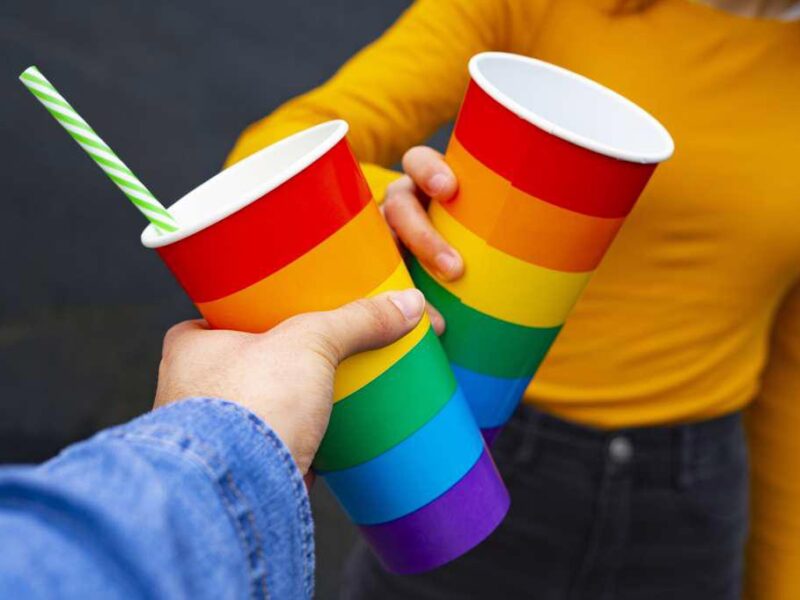
Many brand teams use stock photography or stock video in conjunction with the new product packaging for consumer advertising, POS, social media campaigns, SEO, special events for launching the new packaging, trade media and many other marketing tasks to save money on production. The “hero” is always the new packaging, but the stock images can help brand teams communicate the new look for a fraction of the cost it would take to shoot original footage on location.
*****
With its vast, highly organized, digital archives, SuperStock can offer virtually any look, from vintage to futuristic, for any rebranding campaign. Plus, the research for these images is FREE. Hit us up. Your brand never gets a second chance to make a first impression.


